
Visual identity design
Assets, production and delivery
Brand guidelines
Social assets
Website design
Glasmacher is a stalwart of education in Germany and the UK. A 20-strong company with a 40-year history.
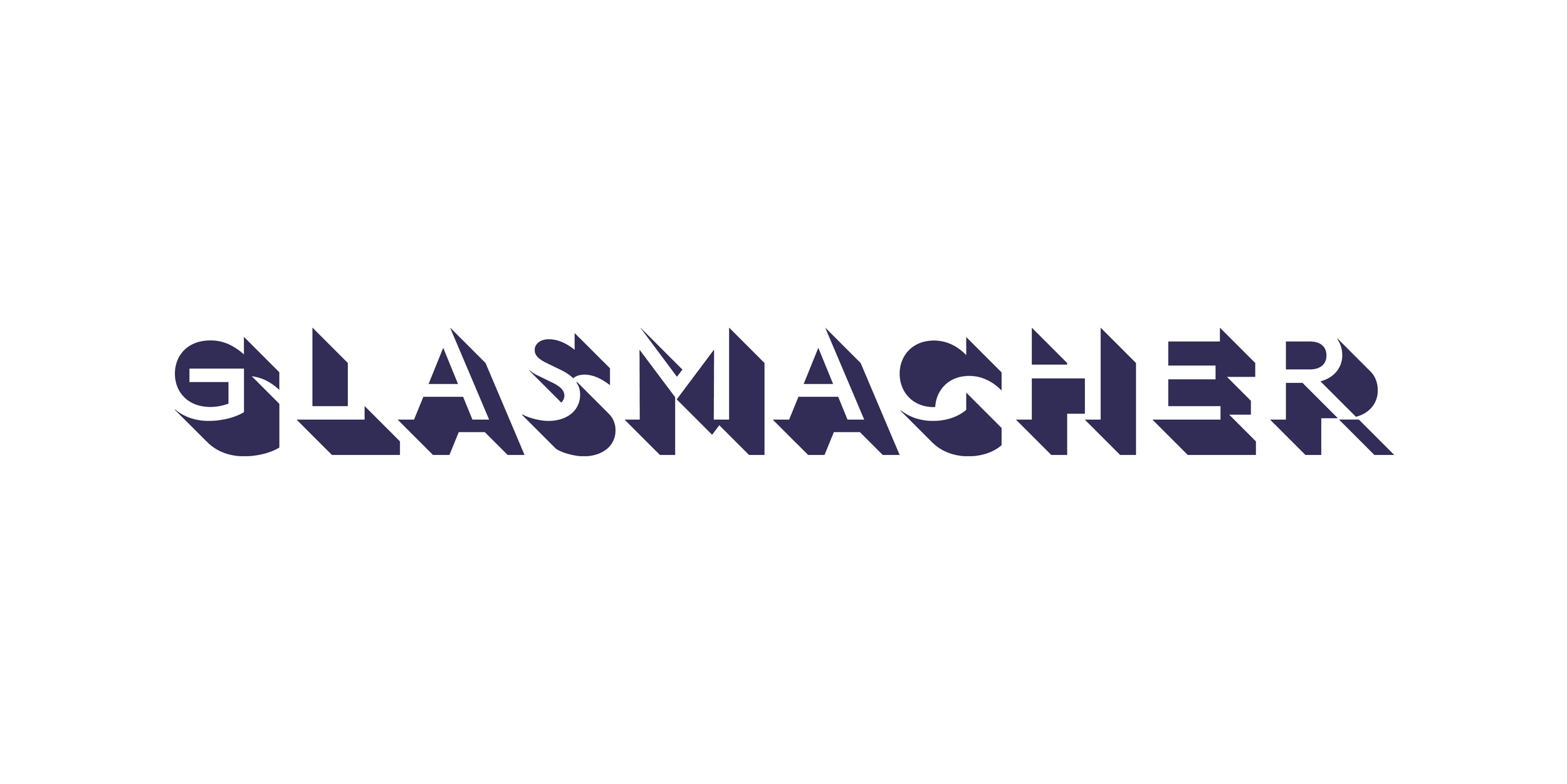
The first task was naming consultancy, some due diligence assured everyone that the name could be shortened to Glasmacher. In common use, a German word, but also the family name, and they had been using the URL for years.
From a visual identity perspective, we needed to land on something timeless, long-lasting, not ostentatious but interesting. The concept was about building something, creating opportunity through a perfectly matched school.
Shadows cast present a way to show physical forms, with the name seen in the spaces between — in the gestalt.
The long shadows also provide a sense of long summers. Long days. Formative years. School and holidays. Adventure and activity. Consequence and progression.
A distinctive graphic style of 3D forms, simple boxes and frames allows for non-image based executions in a way that feels like it’s always been there.
Halftone graphics further signal nostalgia through their style. These are subtle, low impact, high emotion, and suggestive rather than definitive.
The colour palette is a purposeful mix of the contemporary and the classic, allowing for variety between modules especially on the website.
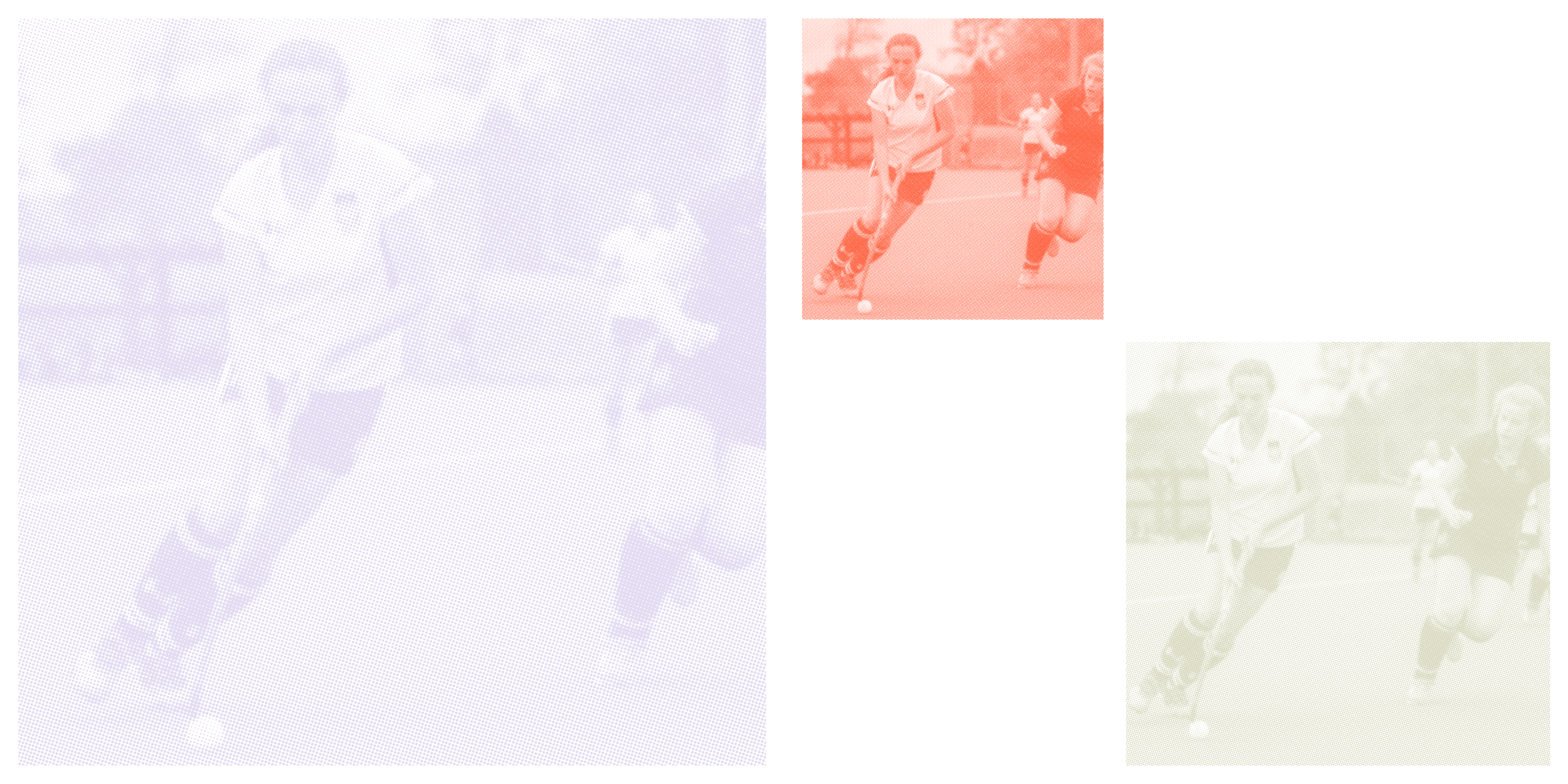
Distinctive halftone image treatment
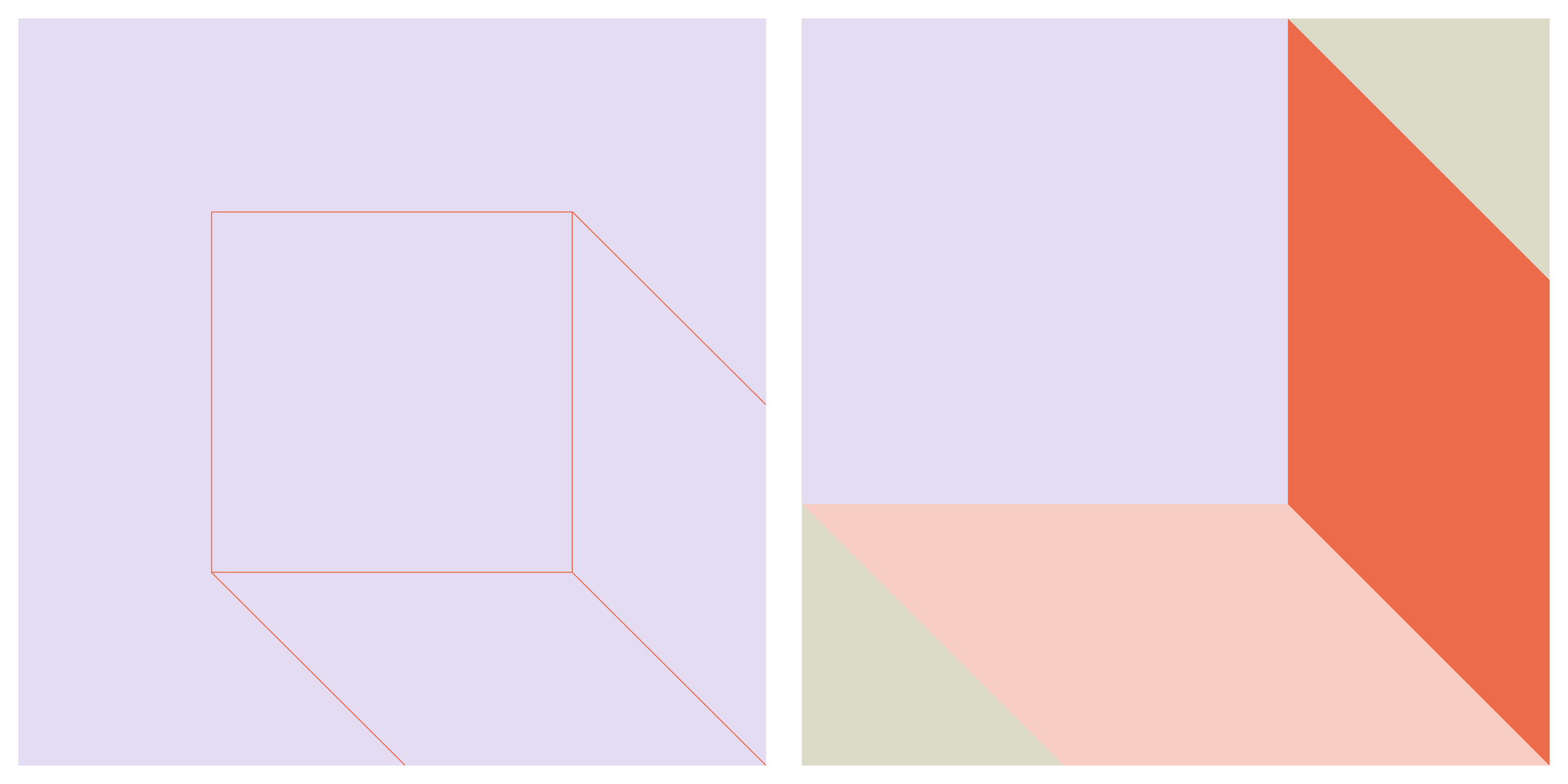
Bespoke graphics allow the brand colours to be used in combination, while referencing the 'long shadows' of the logo
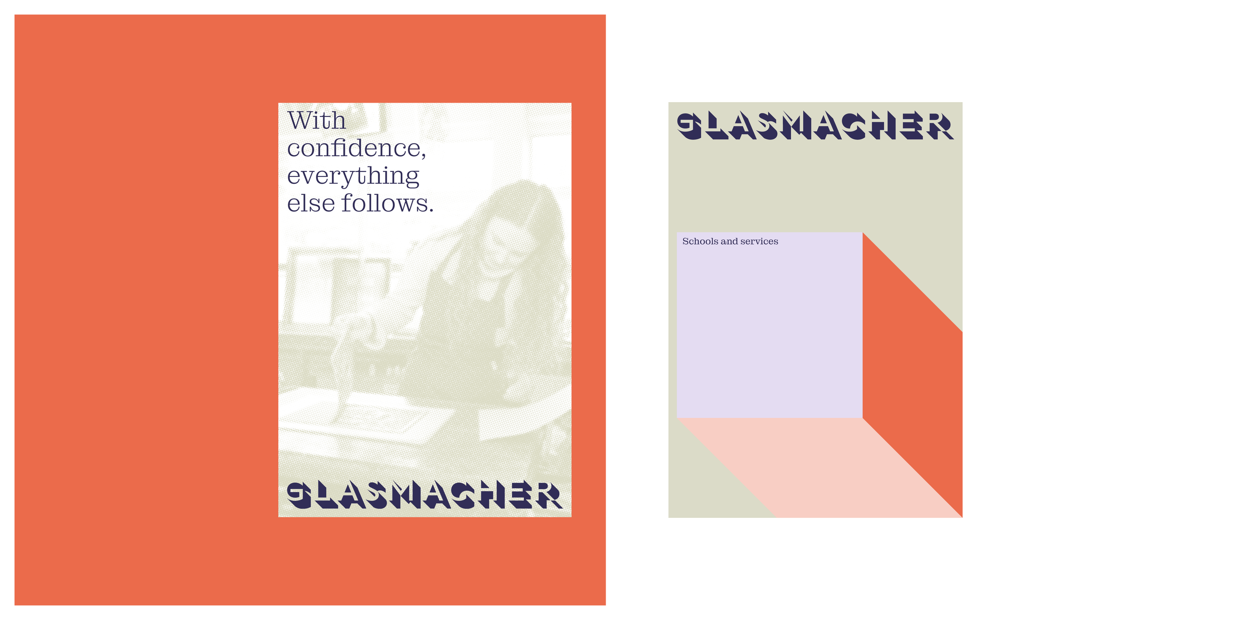
Selected brochure covers
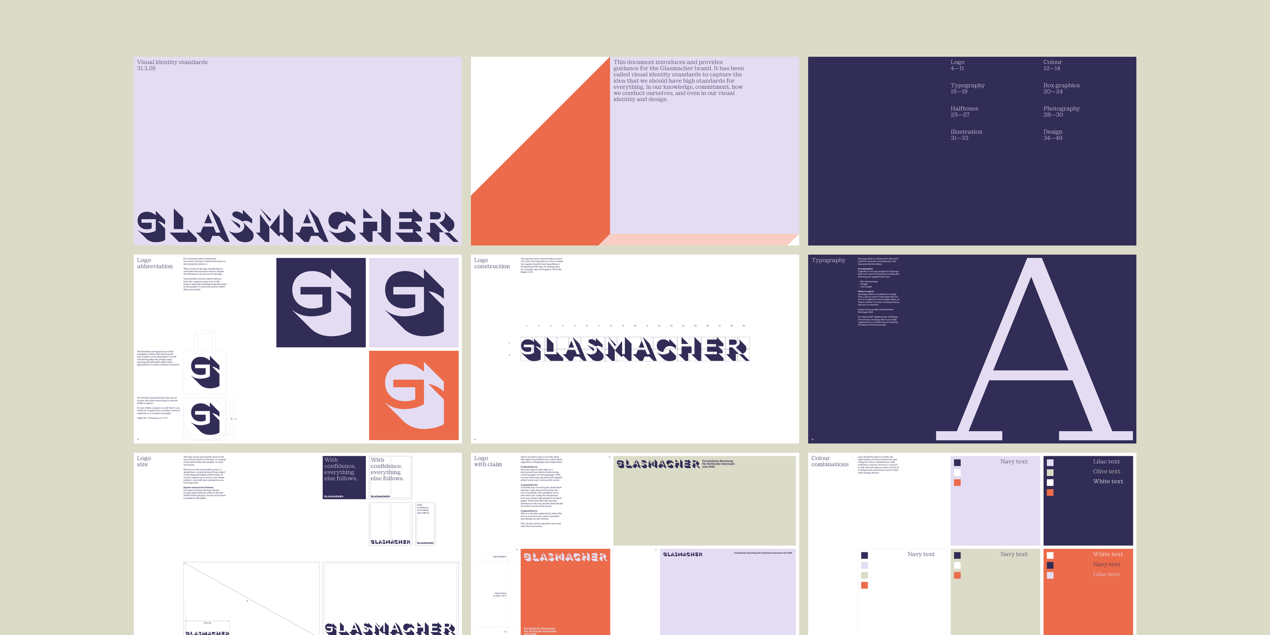
Guidelines book, selected pages
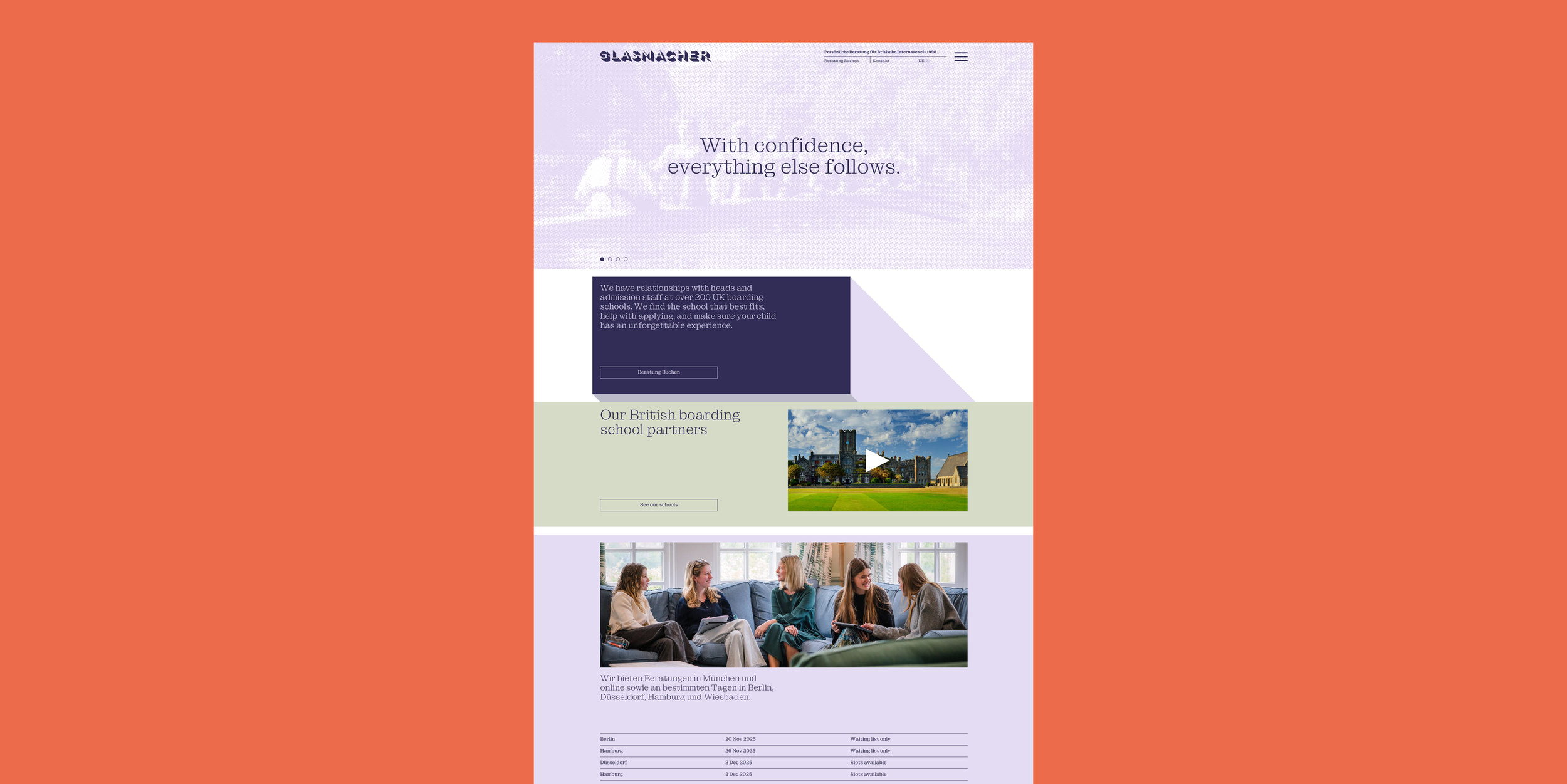
Homepage
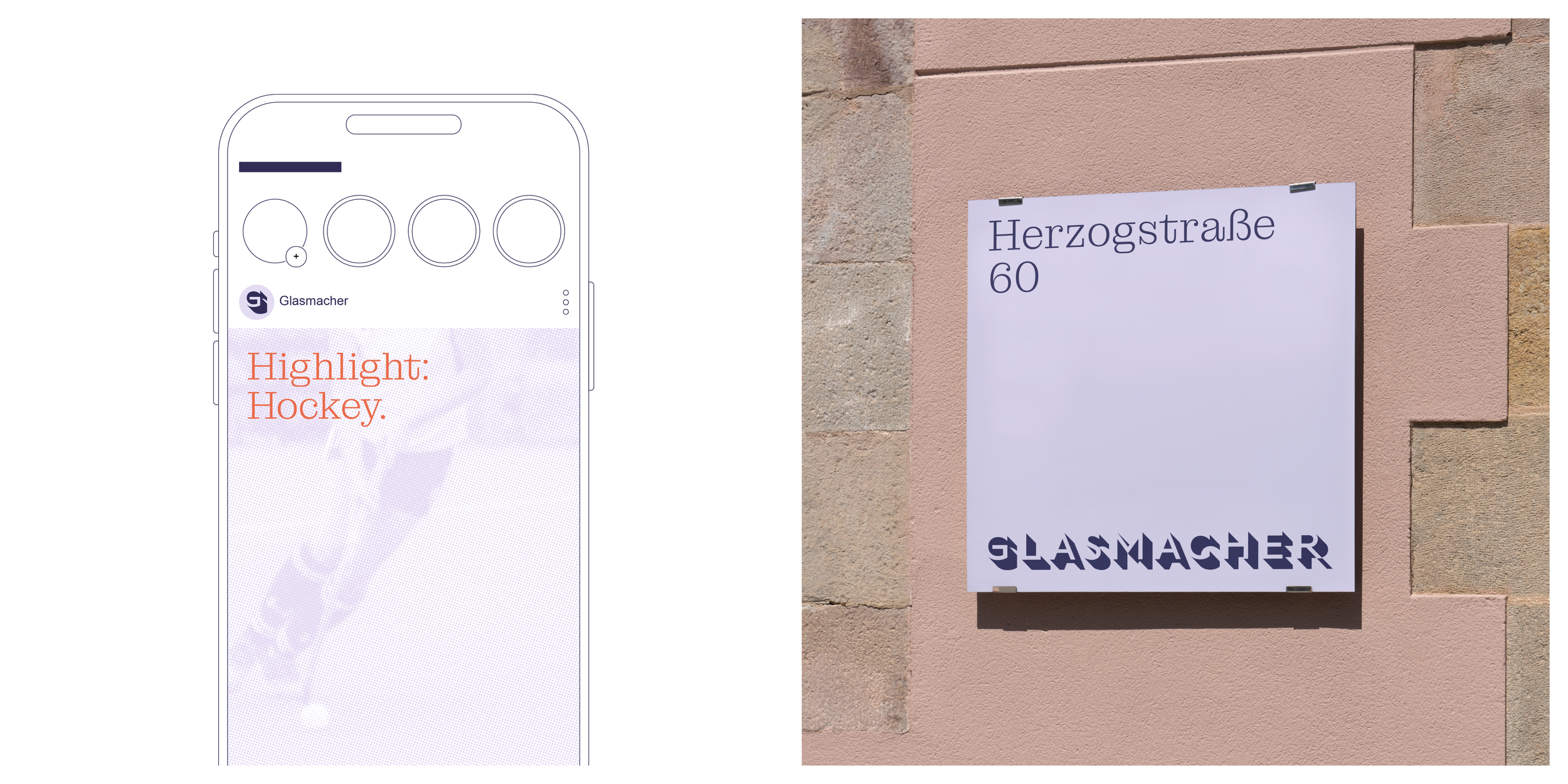
Instagram and office signage
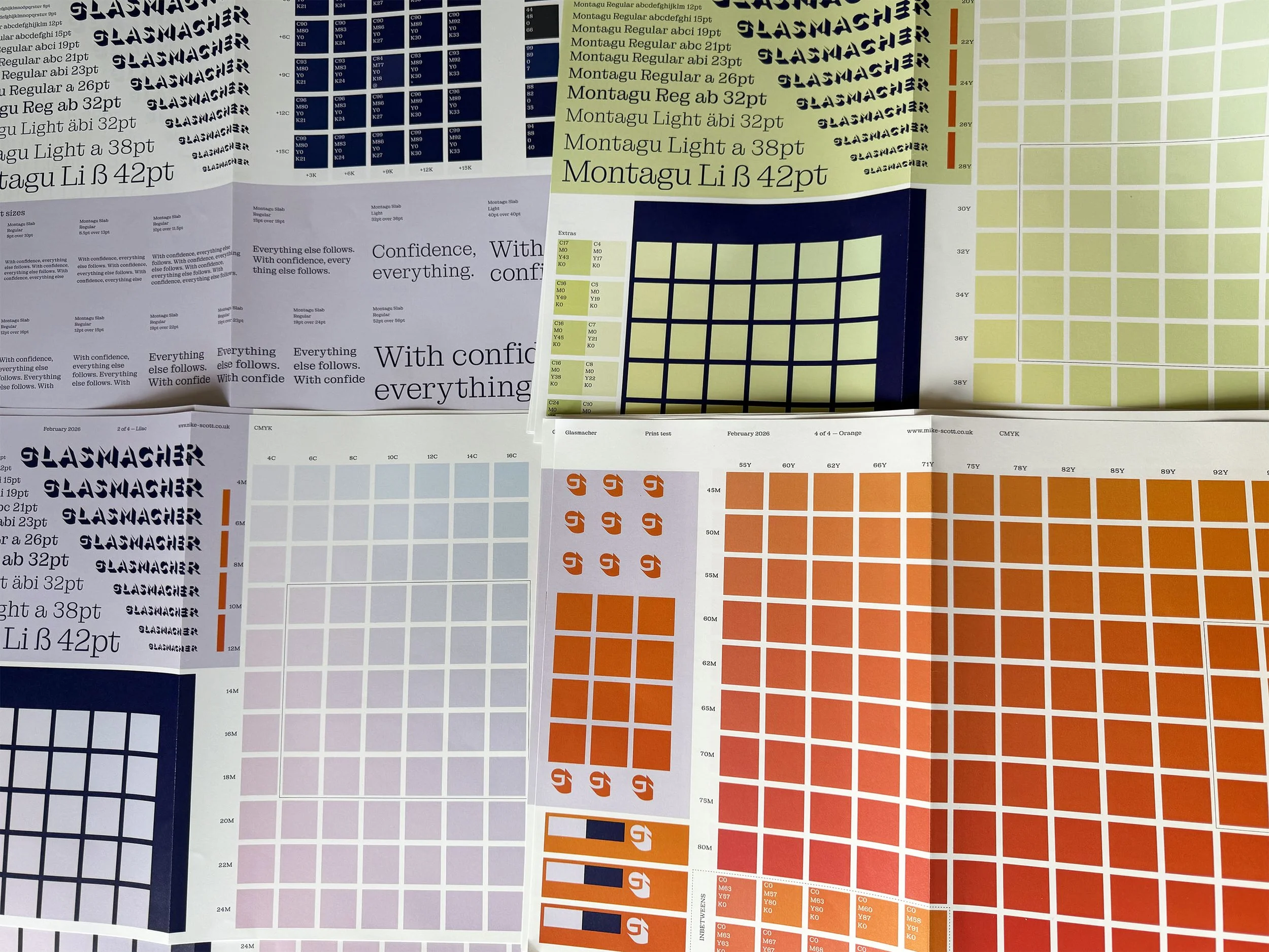
Comprehensive print tests
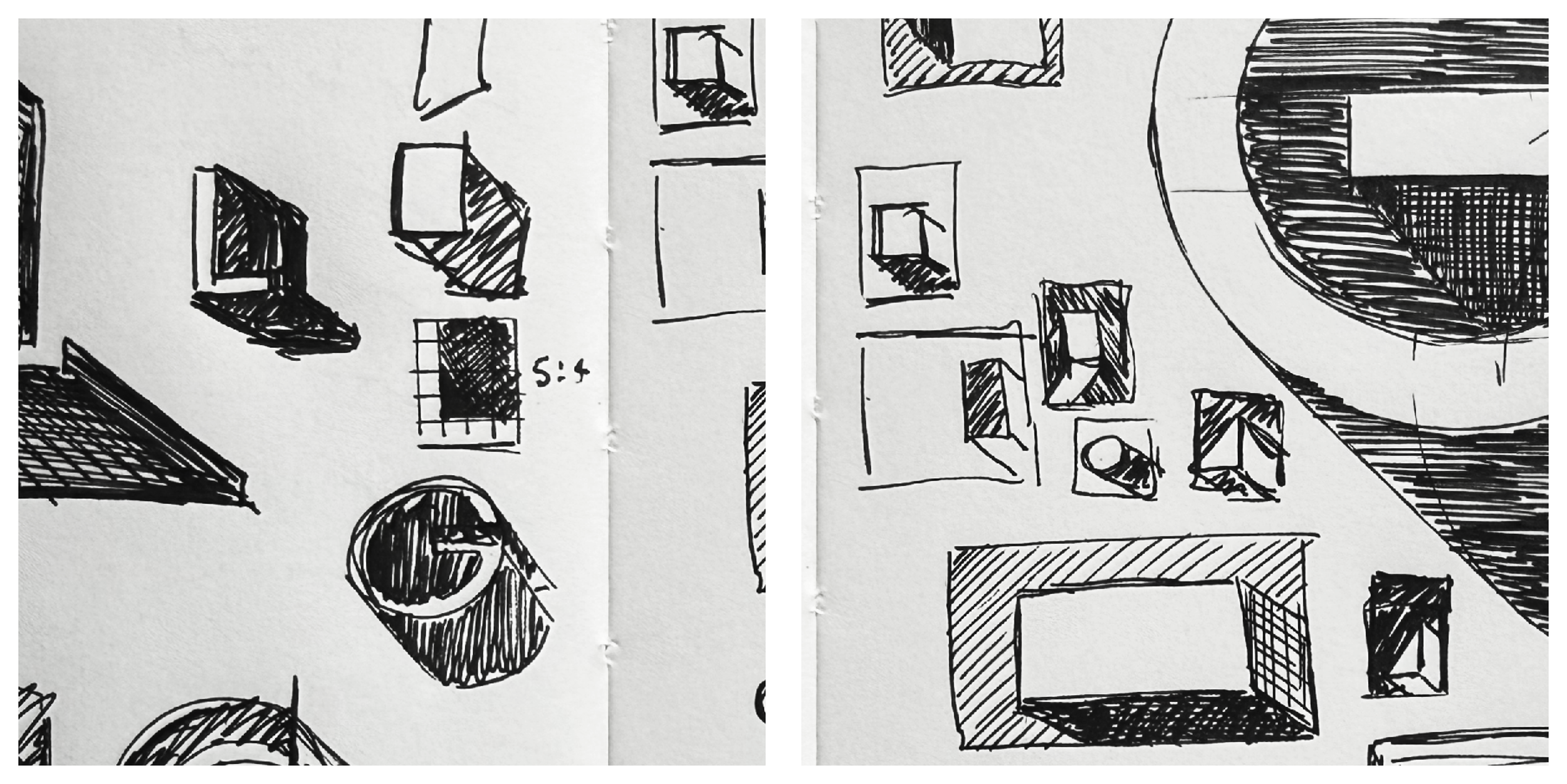
A few early sketches
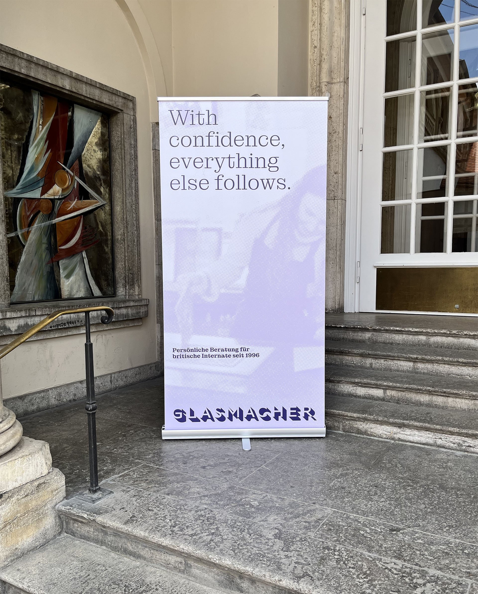
An in-situ snap from Glasmacher’s first event using the new look
Photo: Virginia Jakob