
Visual identity design
Assets, production and delivery
Brand guidelines
Presentation templates
Social assets
Website design
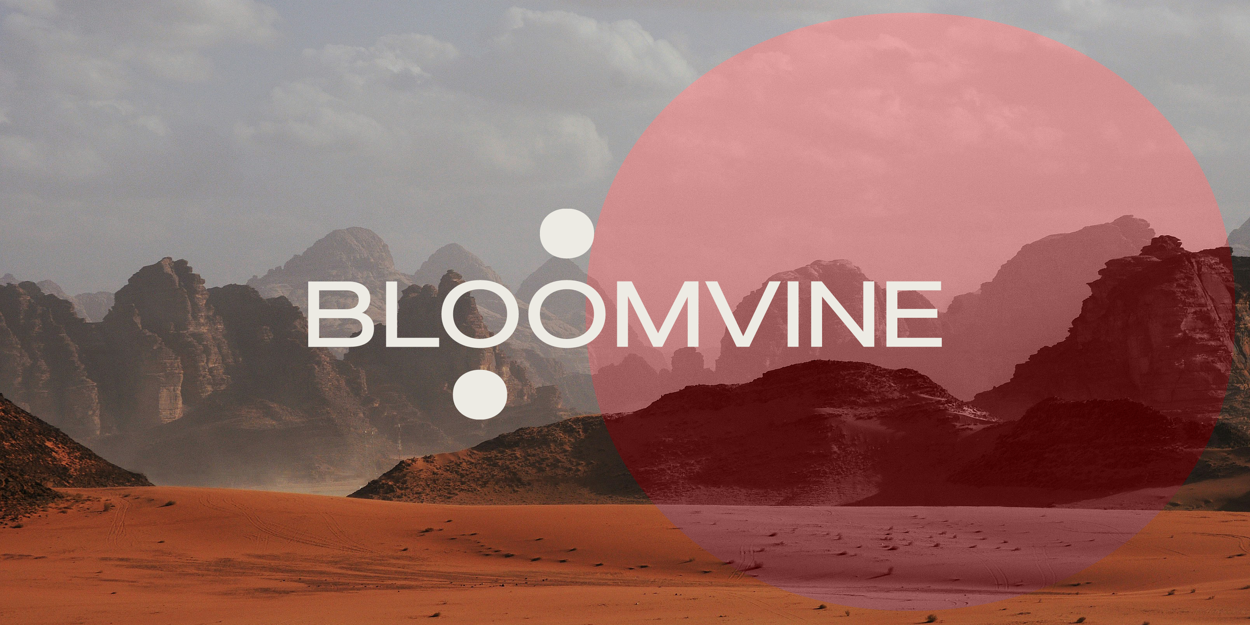
Bloomvine is a new venture in mergers and acquisitions consultancy. The visual identity centres around the idea of finding the perfect fit, targeting the right match, a key aim that underpins the Bloomvine offering. The two counter discs of the letter Os are used in a way that implies they are imminently going to find a place to slot into.
The logo lettering is a bespoke creation, an uppercase, wide-set and mid century grotesk in style.
Colour is a rich, simple palette of oxblood and cream, while photography gives a sense of scale and of possibilities, using vistas and other impressive natural and constructed sites.
The concept of the perfect fit is further played with using imagery and the counter discs as a target over a location in a image, or a treatment where the image is repeated within the disc, but moved up slightly to suggest it is about to fall neatly into place.
Bespoke icons are geometric abstractions, used large and in relation to key services, a distinctive element that doesn’t try to literally symbolise services such as ‘post-merger integration’.
Creative direction, design: Mike Scott
Naming: Letterhead

Logo and target treatment

Variety and flexibility of elements


Bespoke large icons

Selected drawings from guidelines

Website
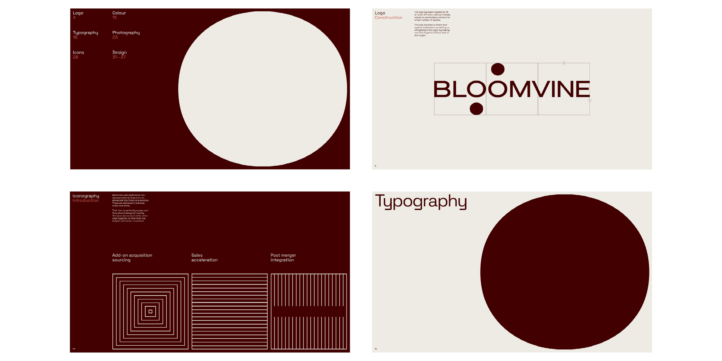
Guidelines selected pages

Selected sketches from exploration and development