Naming consultancy
Visual identity design
Assets, production and delivery
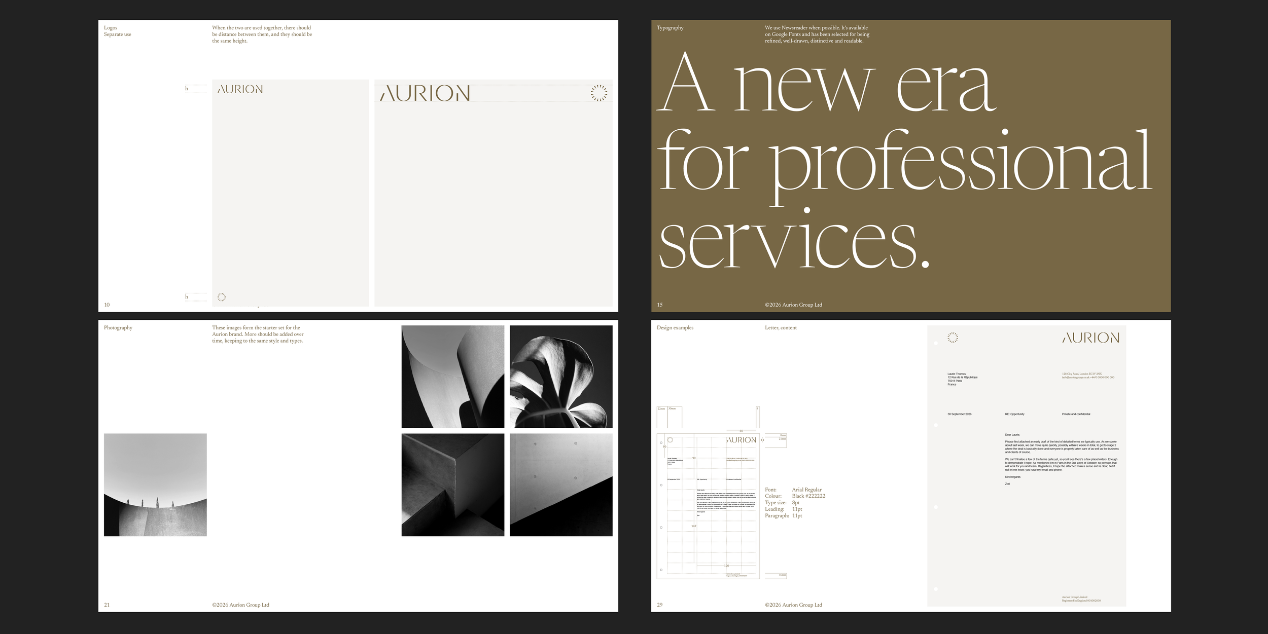
Brand guidelines
Brand assets
Aurion is a new European venture in professional services, with an aim to better connect services across related fields like accounting, banking, investing and hiring. A constellation of connected services. This is where the name comes from, adding the ‘Au’ for gold to Orion.
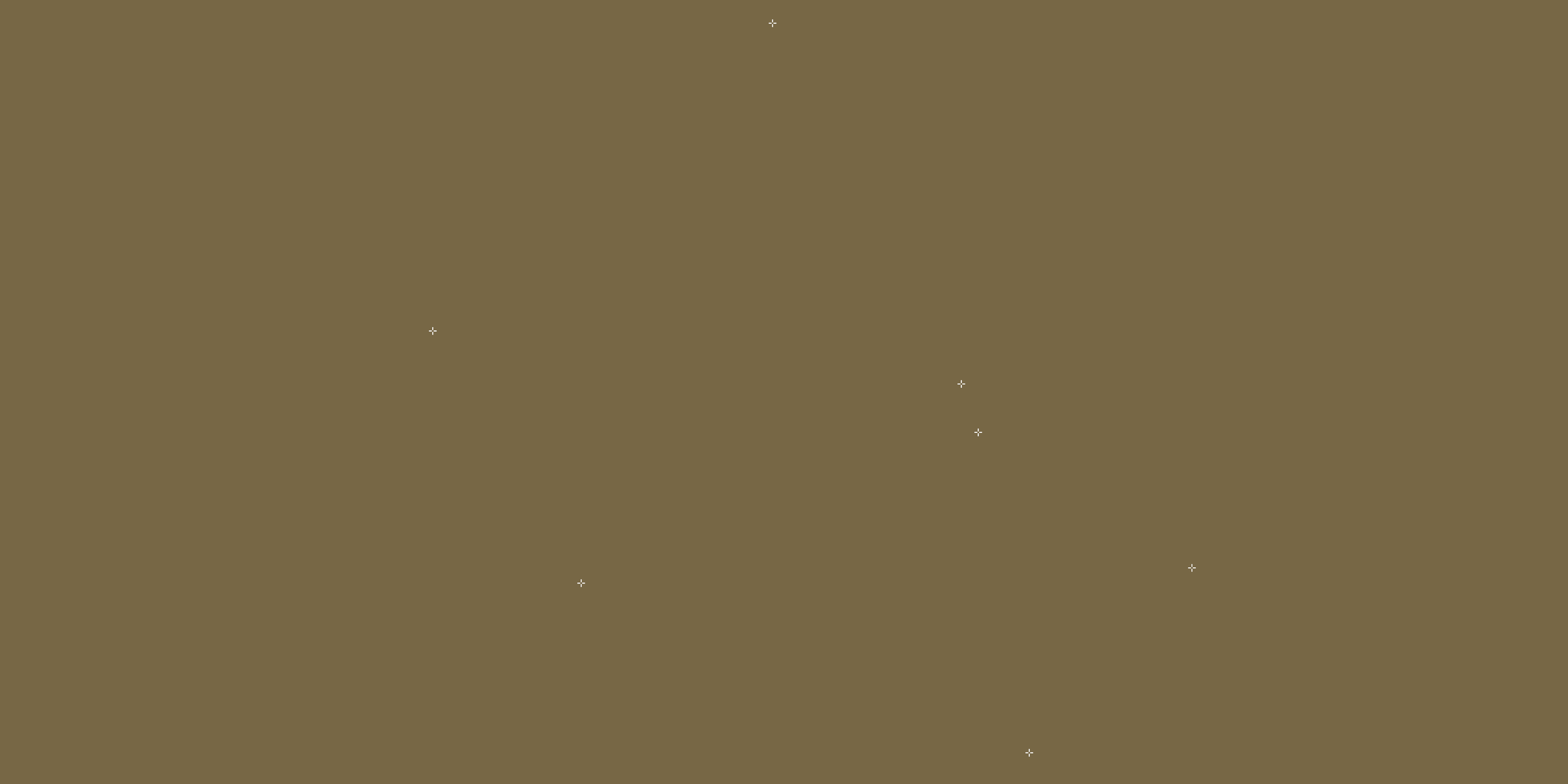
The first task was trademark feasibility of the name, making sure there were no glaring risks. Once comfortable with the name, Aurion loved the idea of carrying the reference through to the visual identity, but in a way that was unique and still simple. Constellations inform a graphic language using a plus for each point. These can remain static, and in animation, can move around, adapt to content or mouse cursors.
The colour palette makes a direct link to the name too, using a gold painstakingly chosen to give just the right feeling that we couldn’t easily describe, but knew it when we found it.
The broader set has 2 tones derived from the gold, a neutral grey with a subtle yellow that feels silvery in a specific way. Continuing the elemental theme, a fresh sky blue allows for highlights and call-outs.
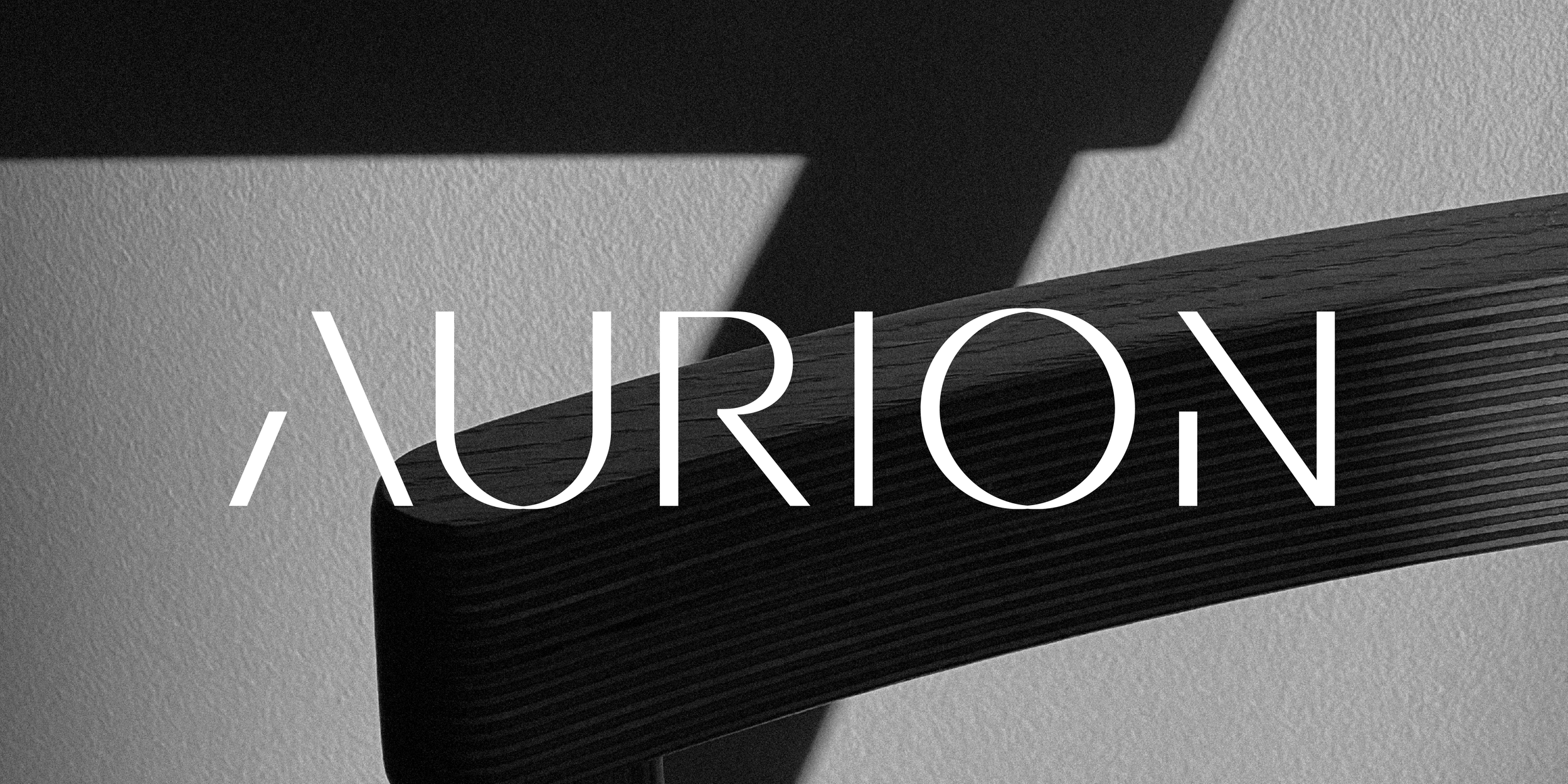
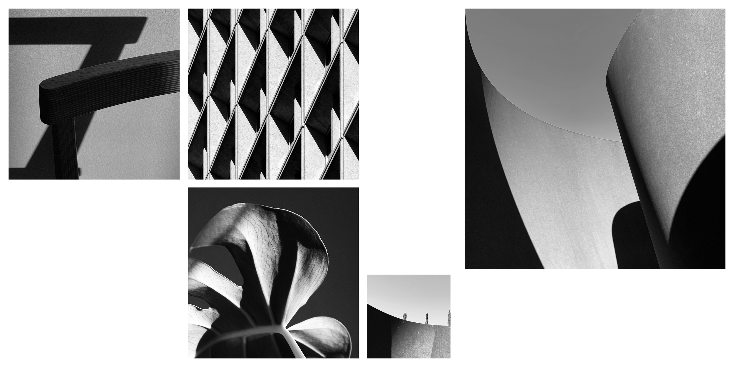
Stylistically, images are strictly high contrast black & white, and conceptually wide-ranging from the macro to the micro, but each with a sense of drama, shadows, time passing. These give something of a monumental feeling that adds to the sense of scale.
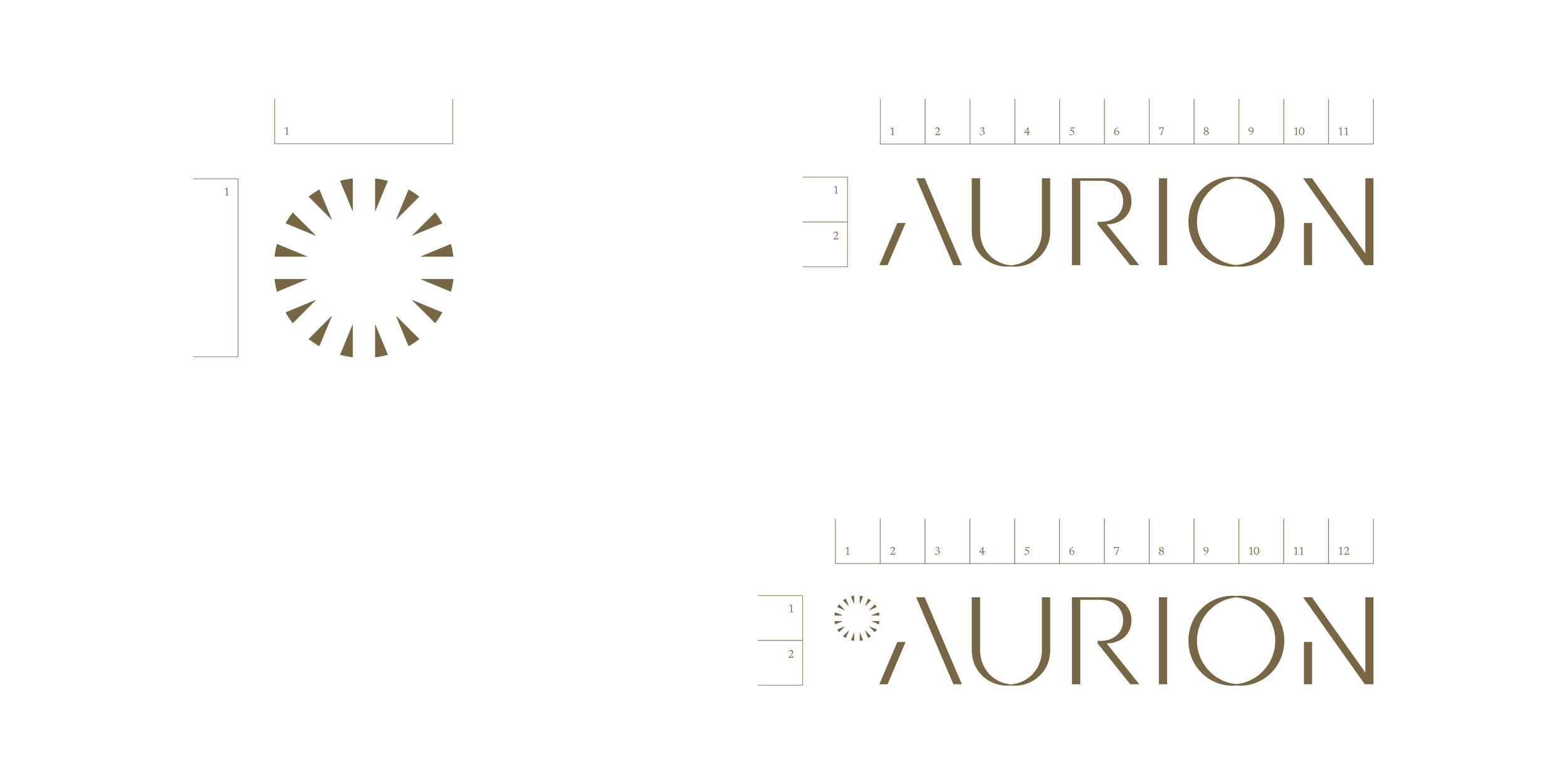
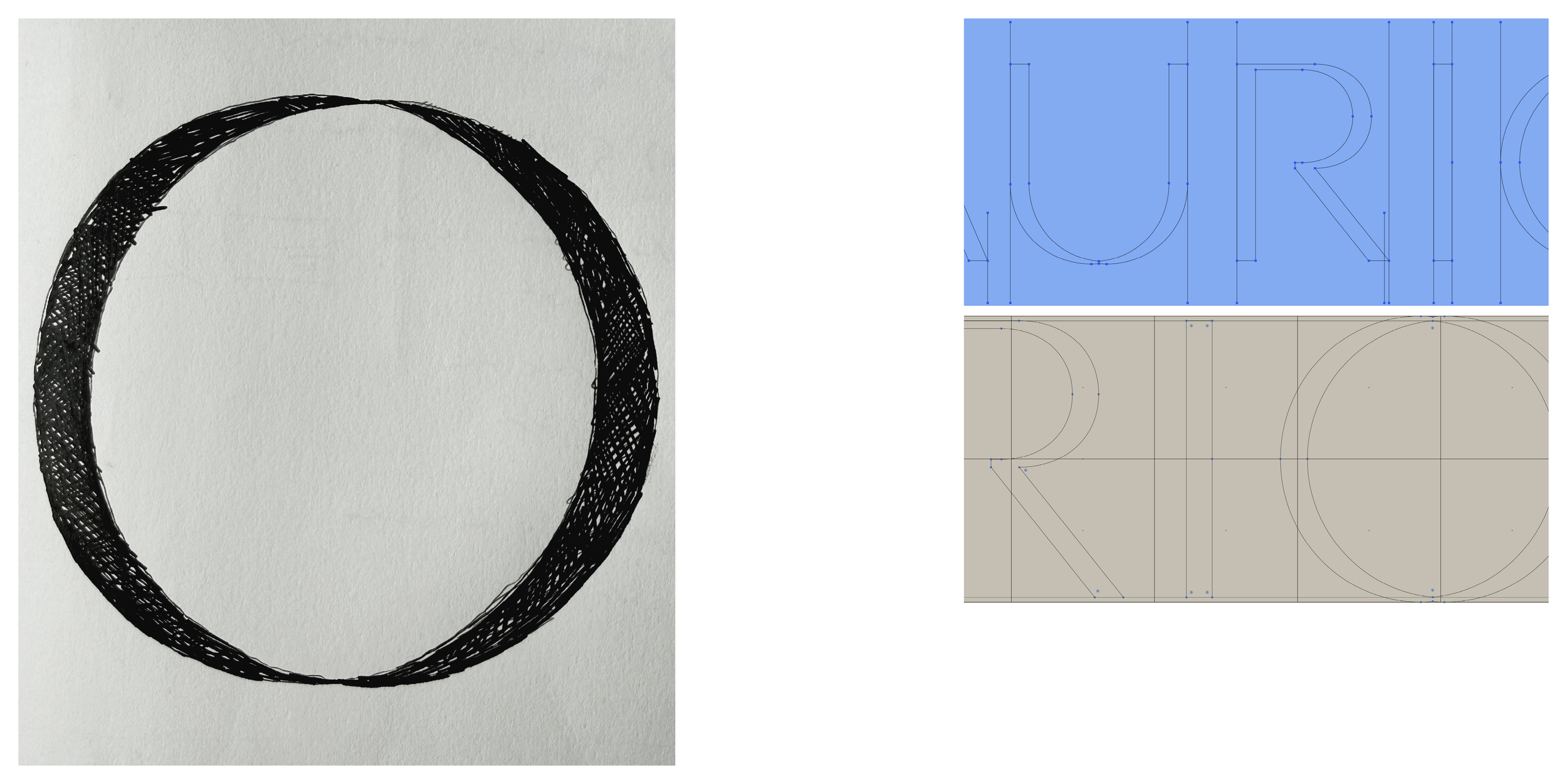
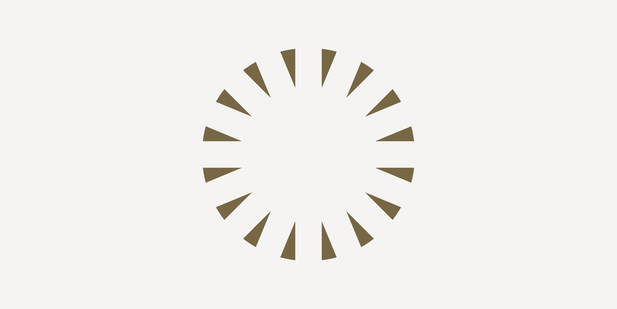
The bespoke symbol is a negative space star, cut out of a disc, while the hand drawn logotype is a unique rendering of the name, with distinctive lettering that feels cut or carved or shaped in metal.